


Integrating an AR motion tracking feature to improve form and technique at home

I designed an AR motion tracking feature for the Nike Training Club app to tackle injury prevention by providing live feedback and form correction via your device’s camera.
Timeline: Feb-Mar 2021, 6 weeks
Tools: Figma, Evolve Research App, Whimsical
Role: UX Researcher, UX/UI Designer, Usability Testing
The Nike Training Club app is a fitness app for phone and tablet that provides free workouts, trainer-led programs, and health related articles to support any “everybody and every body”. Form and technique are the foundation for any kind of exercise and something that people of all experience levels work to master.
The Process
Research
Exploratory Research
Survey
Competitor Analysis
User Interviews
Define
Personas
Storyboard
User Flow
Ideate
Wireframes
Mid-fi Usability Testing
UI Design
Usability Test
High Fidelity Usability Testing
Affinity Map
Iteration
Diving into the problem
I was one of many new users trying the Nike Training Club app when Nike announced it would make premium content free for all users at the beginning of the COVID-19 pandemic. One thing that bothered me as I tried more and more workouts was knowing if I was doing the movements right or not. I felt that we should have the technology - such as with augmented reality - to provide that instant feedback and I wanted to explore some kind of solution for this project.
The complexity of designing for an emerging technology and the doubts over whether this was a widespread pain point led me to do exploratory research as well as a survey to validate how commonly people are concerned with form and technique.
Exploratory Research and Survey Results
79% of survey respondents said that good technique was important to them. One of the common reasons for correcting exercise form is to prevent injuries.

My exploratory research also revealed a spike in workout injury-related internet searches during the pandemic. This told me that many people (including myself) would benefit greatly from a way to get feedback on their exercise form at home.
With the excitement of this idea in place, I planned out my project timeline to stay on pace and figure out what UX methods would help me tackle this problem.
I used this Gantt chart to outline the project deliverables and timeline
Conducting Research
After my exploratory research validated my initial idea, my goal for user research was to analyze the underlying problem itself. I wanted to know users’ goals and methods for improving their form.
Research Methodologies
Competitor analysis: Research other apps or technologies aiming to assist users with correcting their technique at home.
User interviews: Explore the core motivations, habits, and barriers that prevent people from maintaining a physical fitness routine and learning proper technique.


Research Key Findings
Competitor Analysis:
I considered direct competitors as those that offer workout plans on a mobile application. The main strength of these apps are that they mimic the personalized instructions of trainers or classes. However, the weakness of competitors that currently address form and technique is how expensive they are and therefore also inaccessible.

User Interviews:
Our interview participants’ statements agreed with and validated our survey results:
4 out of 4 interview participants said injuries are a concern when exercising
3 out of 4 interview participants said learning the proper technique is important to prevent injuries and bad mechanics in the future.

Insight #1: People use visual and audio references to improve their form
When I asked them how our interviewees worked on their form, I found that the most effective instructions are audio cues on how the body should feel, where you should feel an exercise, and what pain points should force you to stop. Without these cues, people doubt themselves or think “I don’t know if this pain is normal.”
Additionally, people need feedback on their technique so they can improve. To get a similar experience to that of a trainer or class, people record themselves or ask others so they can track and review their movements objectively.
I used the Evolve Research to code my notes and make an affinity map
Insight #2: Information overload creates a barrier to learning the proper form
“Challenges with beginners is sifting through good and bad information online. What’s the source? How reliable? Beginners may have to take it all with a grain of salt and take some changes to figure it out themselves. You would hope that people stop themselves if it hurts or isn’t working.”
- Alex, Research Participant #2
Defining Solutions
My research gave me some ideas for how to design a solution that would mimic the ways people are used to learning exercises.
Solution Hypothesis:
Users don’t want to have to rewind any media for instructions or to restart the workout if there are enough audio cues and guidance.
Users will have better body awareness if they can see themselves performing each exercise.
Users may want a way to record and review their movements later as they do when they only have their device’s camera.
Creating Personas
I created two personas based on behavior patterns from my research participants in order to better recall our target audience’s motivations throughout the rest of the project.
Our functional athlete looks at fitness holistically for longevity and progress.
Our on-and-off exerciser is someone who works out for general well being but has a hard time keeping up.
User Flow
To me, the user flow was the most important part of the definition phase. I needed to figure out where this new feature would fit within the current task flow in the NTC app. One challenge was that the app has four different types of workouts with four distinct flows.
User flow
I focused on enabling this AR “practice mode” when workouts are paused. This had a few benefits that worked with the rest of the features I wanted to include.
This would make it easier to insert the same feature in all four types of workouts.
Allow us to add audio guidance that did not interfere with the main workout media.
Ability to download your recording when practicing without having to download a recording of a whole workout.
I scrapped an idea to place the AR feature side-by-side during the workout as this went against my hypothesis that users don’t want to rewind when they are learning or practicing a movement.
Ideate and Design
Wireframing
As the starting point for our AR “practice mode” would be pausing any workout, I was able to wireframe the same set of screens for this workflow. This would end up being a huge plus later when iterating since I only had one set of screens to revise.
I also created an onboarding sequence as I realized in my user flow that users may need time and instructions to set up their device in case their phone or tablet was not in an optimal position.

Mid Fidelity Usability Testing Results
At this stage, I conducted usability tests on my mid fidelity prototype and the biggest piece of feedback was that it would be helpful to enter practice mode before starting the workout too - not just when the workout was paused. So I reconsidered how to add other starting points for the practice mode flow for each type of workout.
High Fidelity Design
In the high fidelity design, I encountered some contrast and accessibility issues and decided to test them later in usability testing.

Challenge#1:
In the screen before turning practice mode on, I struggled with handling the number of overlays, CTAs, and icons on top of the actual pieces of media. I had a demonstration video and tutorial video to contend with in one screen (something that ended up being completely redesigned thanks to usability testing!)

Challenge #2:
When using the AR feature that tracks specific points on your body, how would I make red (incorrect) and green (correct) points in the body overlay stand out for those that might be color blind? Both red and green had the same value so in grey scale they look the same.
To solve for this I emphasized the incorrect tracking points with some concentric circles.

Challenge #3:
Another concern was whether to make the video of the demonstration bigger or the AR camera feed of the user bigger was in landscape mode. I reached back out to my mid-fi usability testers who mentioned that having the demo video bigger is more helpful, but as with the rest of my questions, noted this down for further usability testing.

Usability Testing
Usability testing in this project was crucial. When I made my usability test plan I had a few objectives:
Validate my assumptions when brainstorming that
People want this feature both before and during the workout
People will want the option to follow the demonstration video while practicing (i.e. they will need side-by-side views of both themselves and the demonstration)
Answer my questions on specific screens from the high fidelity design stage.
Are the actions at the end of the workflow needed?
Did the use of overlays and icons communicate available actions?
Would users be able to see what was happening on such a small screen real estate?
What did users naturally focus on when using practice mode?
I tested my prototype on five participants and recorded each success at task completion as well as identification of buttons and icons.
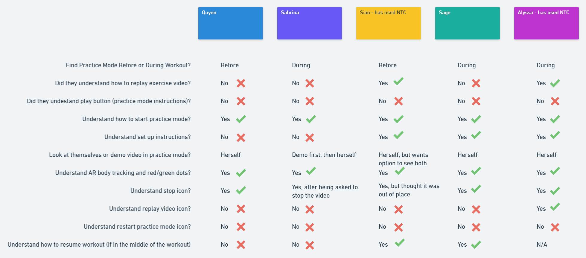
Task completion or action identification chart for my five usability testers
It was clear to me that there were many issues with clarity and learnability in my first version of the design.
My biggest takeaway was that I needed to increase the usability of the feature by simplifying the amount of information presented at once.
Most Common Issues
5 out of 5 users could not figure out how to restart practice mode if they wanted to try another round. Users needed a suggested primary action to take after Practice Mode.
5 out of 5 users did not understand how to watch the introductory video about how to use Practice Mode (intended to act as the first step of onboarding)
Usability Test affinity map
Testing Highlights
On the other hand, our testers loved the concept and validated that our solution was headed in the right direction. With a few tweaks I knew that I could make this work.
“I love the AR feature. It makes sense and it is what I would expect.”
-Siao
“This is so helpful, it actually tells you what you’re doing wrong.”
-Quyen
“This addresses a common problem. People might injure themselves at home and that problem is being solved.”
-Alyssa
Priority Revisions
Simplify the screens
I found that users are more likely to watch the AR video of themselves performing a movement in Practice Mode. So the AR video area on the screen should be increased in size. However, users would also like the option to watch the demonstration video to understand what they are doing.
To accomplish this, I broke up “practice mode” into two steps and made sure that the screen is limited to display one primary action when setting up so that the user only needs to focus on one thing at a time.

Separate the tutorial from “Practice Mode”
I also needed to reconsider where to place information about Practice Mode. The information needed to be more clearly defined from other media.
I created a separate page utilizing an existing pattern in the app for articles (for example, this pattern is used to explain what a “whiteboard” workout is). This would be more familiar to existing users and more uniform with the rest of the app’s current design.
Additionally, I created a tutorial when first entering practice mode that experienced users can skip, but others can use if they need a refresher on the feature.

Clarify CTAs and iconography
I clarified the CTAs and icons used after Practice Mode. Users had the most issues distinguishing between restart and replay recording. I focused on consolidating the actions to those that users really need and labeled each of them for clarity.

Conclusion
I learned a lot from this project and felt a personal connection with insight when reflecting on my own quarantine fitness experience. This one of my most challenging projects to date, but I gained a lot of insights as a designer.
Exploratory Research
For this project, I felt like I had a great concept to design an AR feature, but I wasn’t sure how to validate if it was what users really needed nor if I could actually design an AR feature that was helpful. I took time to define and validate the problem space which helped me create specific research questions and feel more confident in asking the right questions in my UX research.
Importance of Usability Testing
Usability testing was really important in this project as it reminded me to prioritize simplicity in my design. In this modern digital world, our attention span only lasts so long. in the context of a workout on a smaller screen, how could I expect users to focus their attention on multiple things while potentially jumping around and sweating. Thanks to my usability testers, I was able to refocus on usability and simplicity for this feature.
Designing for accessibility moving forward
While not within the scope of this project, some of my favorite feedback from usability testing included ideas to broaden accessibility. If there were more time or future phases, I would love to see these enhancements.
One of my testers specifically had scoliosis and asked how the app would define “successful” movement for someone with physical disabilities such as hers. I loved this feedback and think it’s really important that “every body” (as Nike puts it) is able to participate in the workouts and perform to its greatest potential.
While I had thought of using voice commands in my ideation, I was never able to figure out how to “stop” practice mode more intuitively. Testing participants noted that they expected Practice Mode to stop when they had successfully mastered the move. They indicated that having to walk back and forth from their device to stop Practice Mode did not make sense.