Taking a side hustle dream to an e-commerce reality
Heat LA is a Los Angeles based streetwear and sneaker reseller wanting to create an online eCommerce site instead of relying on other selling platforms such as eBay.
Timeline: Jan-Feb 2021, 6 weeks
Tools: Figma, Miro, Maze Remote Testing, Whimsical
Role: Branding, UX Researcher, UX/UI Designer, Usability Testing
To turn this dream into a reality, we began from the ground up with a responsive web design and establishing a brand identity to start up this small business. Through the process, we discovered some unique characteristics about this market and its customers due to the exclusive nature of its products.
The Process
Research
Value Proposition
Competitor Analysis
Contextual Inquiry
User Interviews
Define
Problem Statement
Personas
Task Flow
Site Map
Ideate
Sketches
Wireframes
Branding
UI Design
Prototype & Test
Interactive Prototype
Usability Testing
Iteration
Kicking off a small business
Starting a business is exciting, but I knew there was a lot to consider before launching a site. I felt it was important to help Heat LA’s owner, Matt, determine what his value proposition was, what his target audience looked like, and to set up some short and long-term goals. Before starting this project, I asked my stakeholder to answer a few key things which hadn’t been considered yet in the excitement of starting a new website.
Q: What is your value proposition?
A: I know I can sell on the basis of competitive pricing and trustworthiness within the local community.
Q: What are your Key Performance Indicators?
A: Initial page views and number of orders
Q: Who is your target audience?
A: Footwear and apparel enthusiasts, both collectors and casual buyers
With this in mind, our high-level objectives were:
Design a responsive website that is simple, informative, user-friendly, and has a streamlined checkout.
Create digital visual styling to establish brand identity.
Through Matt’s expertise and some secondary research, I also learned that reselling exclusive streetwear and sneakers comes with niche market practices that present unique design challenges:
Resellers routinely charge different prices for different size sneakers.
Our stakeholder usually has both new and used items of the same product. This would make it more challenging to display all the available options for buying.
Conducting Research
With our value proposition in hand, we could pivot to our users. What did they need? What were their motivations and habits? To find out, I completed a competitor analysis, contextual inquiries, and user interviews. I also took a deep dive into the current market via secondary research.
Main research goal: How did users start shopping and where did they first look?
Competitor Analysis
A comparison of various sorts and filters from competitors revealed a lack of universal shopping standards.
Our competitor analysis revealed to me that our competitors were trying a variety of sort and search methods with little similarity. The only overlap was price, date, and size.
The question was, what would actually match our users’ mental model when shopping?
Contextual Inquiry and User Interviews
Matt from Heat LA put me in contact with a few people in his online communities and with his actual customers for contextual inquiries and interviews.
User Interview Findings:
The typical streetwear consumer is resourceful and discerning.
Users already know what they want, how rare it is, how much it may cost and resell for, and what it should look like.
Rather than always navigating around a site, many users will have a link directly to the product they want to buy or will enter the exact item in the search bar.
Key Insight:
Most importantly for this project, I learned buyers are cautious when approaching sellers that are unvetted and must weigh the cost-benefit quickly or risk missing out on “copping” that item altogether.
“I thought I bought a pair of sneakers, but it turned out to be a very expensive mug.”
- Perry, Research Participant #3
Defining Solutions
Personas
I created a set of personas to help me remember key goals and frustrations. I realized our research participants represented multiple types of consumers, rather than a single consumer group.
Our primary persona, the hypebeast, is motivated to add to his collection and “flex” on people.
The splurge buyer hopes to get something personal that they will love to wear.
A secondary persona, the reseller’s motivation is to make a profit on popular items.
The key difference between our personas was their primary motivation for shopping. Were they looking for a wishlist item, adding to their collection, or buying something to resell later?
In reviewing our personas and research findings, I was able to consolidate key insights into one problem statement: Streetwear buyers want proof that they are buying from a trustworthy seller in order to get items in the condition they expect.
Our priority was clear - how might we make users feel more confident in Heat LA and how can they verify the exact product they are going to get before it even ships?
Coming up with solutions
The most crucial element to solving this was in the ways that I could display information to expedite confidence in buying and provide quick checkout. To this, I had some hypotheses:
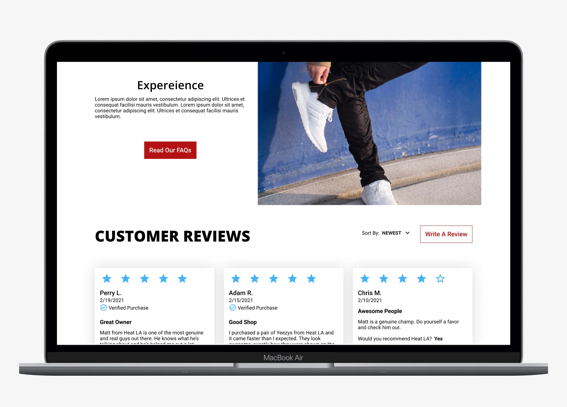
Include reviews from past buyers to instill confidence in Matt’s trustworthiness as a seller.
Include info “at-a-glance” and high quality images of the exact product to allow buyers to verify the item for themselves.
Provide an “About” page so users can build a connection with Heat LA and affirm that our stakeholder, Matt, is an expert in checking for authenticity.
User Flows
Our main user flow focused on the different ways a customer could get to the same product in order to add to cart.
Site Map
Additionally, to improve on the current shopping experience, I felt making enhancements based on basic usability principles would elevate the Heat LA site over the competition by providing the feel of a trusted established online seller.
With these ideas, I was able to define what pages and features to include by creating a site map.
Site map for Heat LA
Ideate and Design
I created a handful of sketches before moving on to low-fidelity wireframes guided by our research findings. I wanted to make sure that information was always visible “at-a-glance.” I knew our target audience wanted an efficient way to shop without sacrificing time on questionable sellers or streetwear with unverified authenticity.
In the initial wireframes, I kept the following in mind:
The search bar should always be available and easy to find. Most people only use the search bar because they know the exact item they want.
Use intuitive filters that match the habits of our shoppers. Since users know what brand or item they are looking for, they only filter by size and condition. Extra filters are simply not needed.
Provide all info at a glance so that users don’t waste time finding a shoe only to find out it’s out of stock or not their size.
Use system status and other signifiers to confirm user actions (such as active CTAs for checkout, verify user selection, display stock availability, etc.)
Creating a brand identity and visual style
Throughout our research and definition processes, I also worked on establishing Heat LA’s brand identity. We did this by creating a mood board with our stakeholder to hone in on the brand’s digital look and feel which helped us establish our visual style tile.
We landed on a logo that calls back to the classic Air Jordan 1, an icon in the sneaker world, and an emphasis on the “LA” letters to represent a commitment to the local community.
From there we also created a style tile to achieve a modern, fresh, and minimal visual design that looks effortlessly cool, but inviting for both new customers as well as the avid sneakerhead.
High Fidelity UI
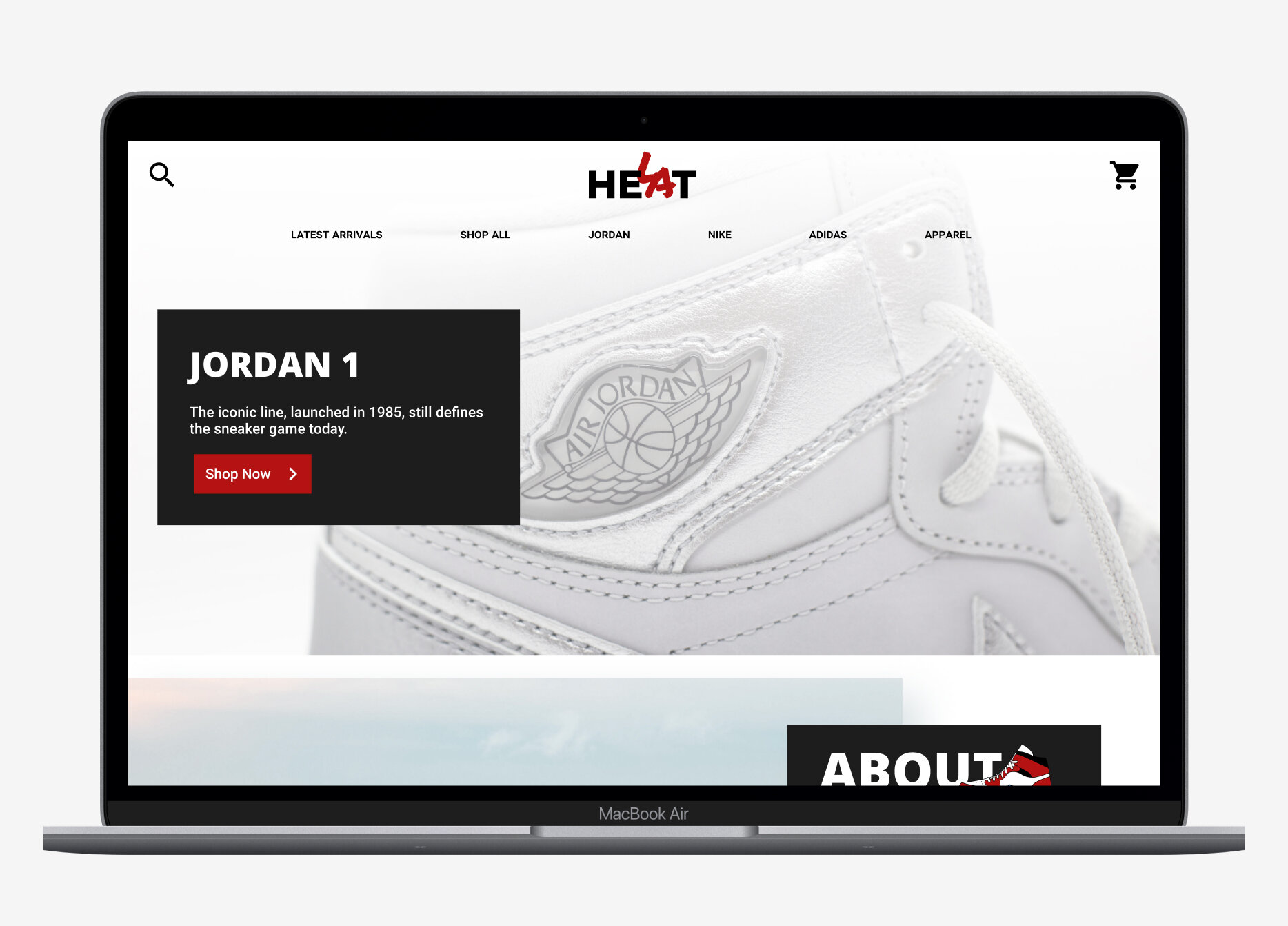
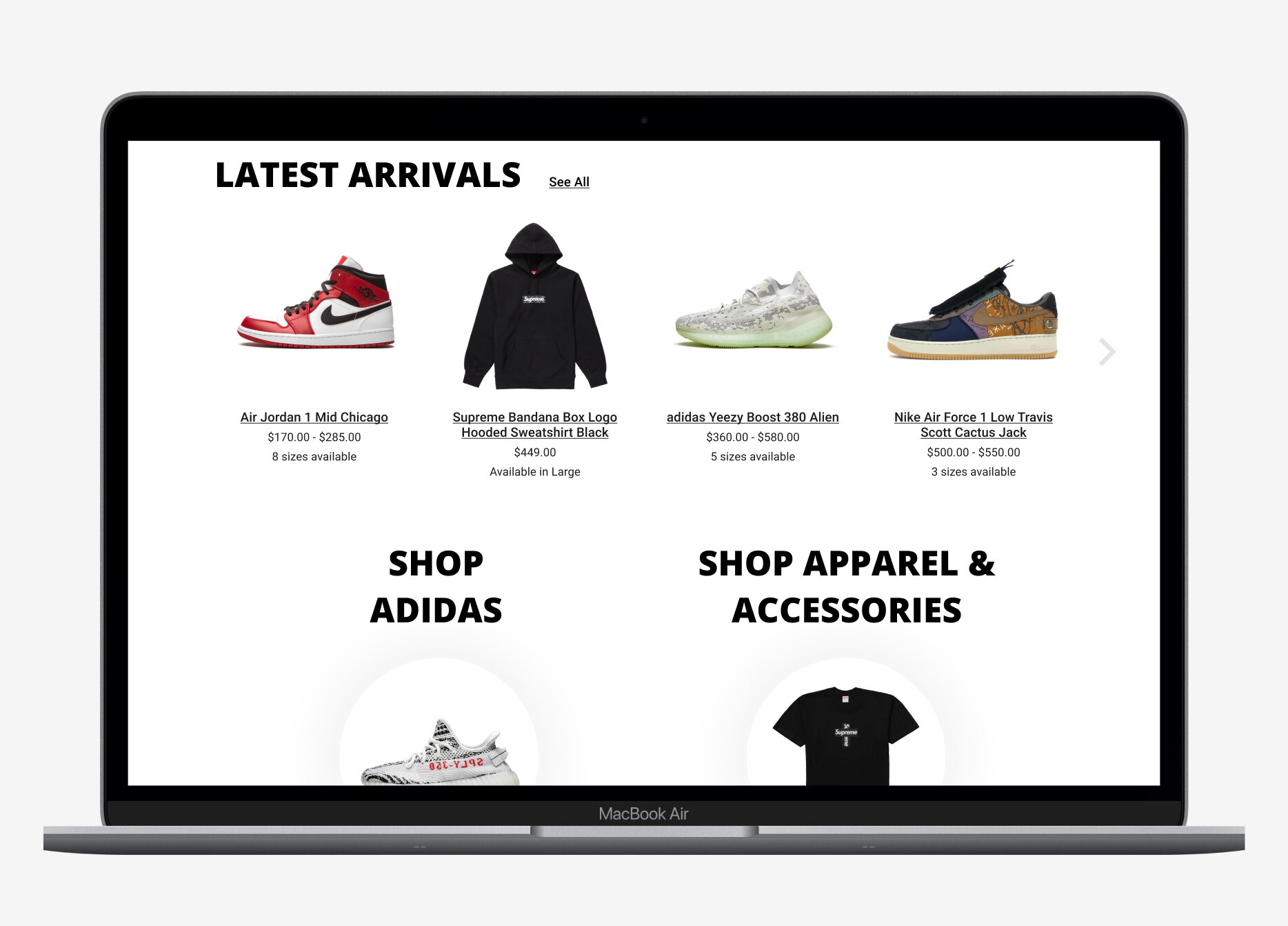
I completed a few iterations of the home page, product page, and product detail page while working with the stakeholder to finalize our high fidelity UI. The original layout from the wireframes was largely unchanged, but at this stage, it was important to consider how various elements might interact with each other in the final prototype.
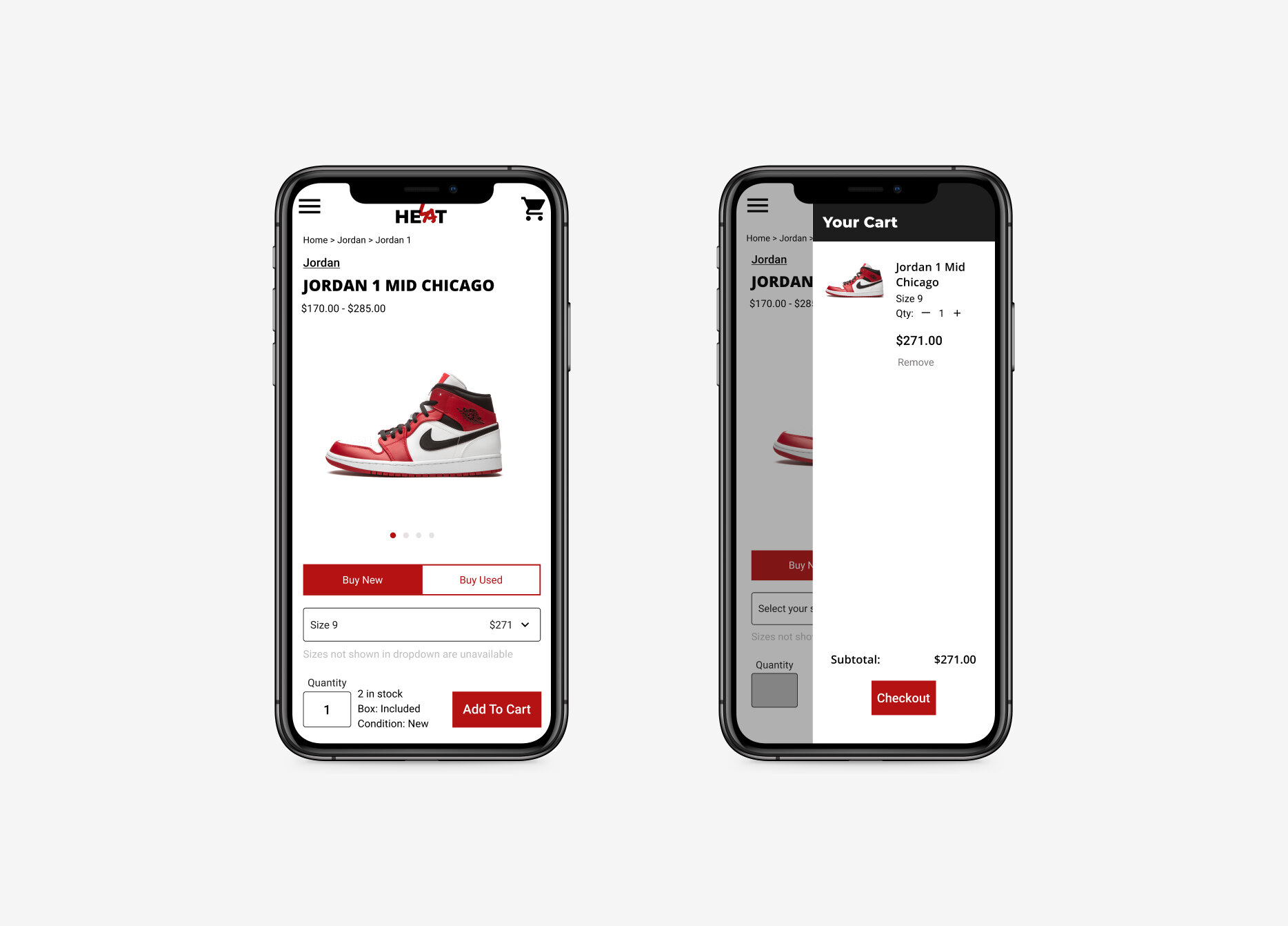
Toggling between new and used options refreshes product images
To solve for the fact that Heat LA would be selling new and used items, I implemented a toggle that would allow the user to see the associated product images.
This was especially important for used stock as the condition from shoe to shoe could vary widely.
Updating product details based on size and stock selected
Details for a specific product could vary widely. To communicate the exact price, condition, and what else may be included, I added space for additional details that would refresh upon the selection of size.
Separate “About” and “FAQ” pages for navigation
I separated the “FAQ” page from the “About Us” page in order to optimize navigation and focus the content of each page.
This would allow the separate FAQ page to be easily linked to other pages when users may be searching for specific information.
Provide user feedback by updating search results on filtering
The number of product results refreshes with each filter applied.
If filters are selected, tags display to show which filters are applied and to allow the user to easily remove them.
The number of filtered items in stock display next to the filter label itself.
I wanted to ensure that users know the quantity and type of items in stock within their current search.
Prototype and Usability Testing
Round 1: remote, unmoderated testing of navigation
I ran usability tests to confirm if our design was navigable and informative. The first round of testing consisted of an unmoderated, remote test in which users were asked to navigate to the “About” page, a sneaker listing page, and a specific sneaker’s product page.
We found that users had no problem getting to the sneakers or getting them into their cart. Remote testers had 100% success in getting an item to cart with only a 6.3% misclick rate.
A heatmap of our usability test
However, users had issues finding the “About” page in order to learn more about Heat LA.
We found that the placement of this was too out of the way. Users were scouring above the fold or to the footer instead.
Round 2: moderated testing of the shopping experience
In our second round of usability testing, we conducted five moderated tests over Zoom. I walked our users through the shopping process to test if we had provided intuitive search features and the information needed to feel confident enough to add to their cart.
To sift through all our findings, I created an affinity map to organize positive feedback, observed assumptions, pain points, and suggestions for each page in our task tests.
Each participant’s comments were color-coded to easily see agreement across many participants. Additionally, I divided up responses by page.
Positive Results:
All five participants rated the task of getting a product into the cart 5/5 in terms of ease.
“Getting to the cart is a 5, a 10. It was so, so easy.” -Calley, Tester #2
Our participants rated the task of navigating to the product 4.6/5 in terms of ease on average.
What to improve:
In the end, our most common feedback was to ensure that all product images, descriptions, and details represent the exact item that will be bought and shipped to the user.
Where we had ambiguous wording or images, we found our participants were confused and turned off. It was important to our participants to feel in control and confident that what they were buying was authentic and true to what they see on the site.
Revisions and Next Steps
Following our usability tests, I created a prioritization matrix to rank the feedback received.
With the stakeholder, I prioritized the revisions that would make the highest impact with the lowest effort. These were iterations that would build on existing elements and would take little time to rework.
Revising seller reviews on the “About Us” page and Product pages:
Add more information to each review
Add reviews to the product page and link reviews to “About Us” page.
Providing more visible entry points on the Home Page
Bring “About Us” above the fold for easier access.
Add more shopping categories to provide more entry points into the shopping process.
Refining usability when shopping
Better separation of “Quick View” hotspot from product detail hotspot.
Ensure “Buy Used” and “Buy New” toggle doesn’t look inactive if user can click it (i.e. change from lighter color).
Separate apparel sizing from sneaker sizing to prevent confusion.


Conclusion
This was a fascinating and fun project to work on for this client. It was interesting to learn about an entire community of sneakerheads and to sense their excitement for the brands, products, and people. It was also rewarding to help deliver on a long-time dream for my client in more ways than just design work. It felt like a startup environment as I often chatted with Heat LA about their plans for marketing, infrastructure, and long term goals throughout the project.
Establishing a business
Though I was asked to come on board this project as a designer, I wanted to make sure we had a solid foundation and that my stakeholder felt as ready as he could at site launch. I talked about marketing strategies, target audience, and the best ways to connect these to the site user experience and overall customer experience. Though it was new to me to consider how to come up with some of these strategies myself, it was insightful to consider these questions.
Connecting users back to the stakeholder
A combination of my own secondary research and user research helped me understand the overall market space and the unique problems associated with such a niche type of product. Being able to talk directly with sneakerheads and our target audience was invaluable. By echoing my users’ motivations and pain points back to my stakeholder, we could confidently affirm our way forward in our design.


